Last Thursday was an exceptional day for Swap Spreads (a.k.a Spreadovers) in the US. We saw some large price moves, and these were significant enough for their increasingly negative levels to hit the mainstream financial press here, here and here.
Prices
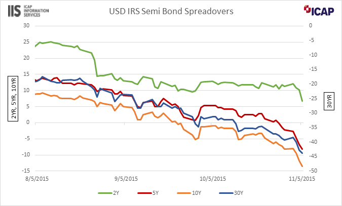
As we can see in the chart below, Swap Spreads have been on a steady move lower over the past three months across all maturities:

Showing:
- The chart covers the period from 5th August to 5th November for Spreadover maturities of 2 years, 5 years, 10 years and 30 years
- We see a gradual move lower for all maturities that increased in pace and magnitude on 5th November
- 30 year swap spreads have been negative for some time (right hand axis), whilst 10 years broke into negative territory towards the end of September (left hand axis).
- From reading the many articles written so far, and from experience, it is not unheard of for some benchmark swap spreads to drift into negative territory…
- …but it is unusual for them not to bounce back quickly.
- And the sharp move into even deeper negative territory on Thursday last week across all tenors is pretty much unheard of.
(Thank you to ICAP Information Services for providing this data).
Volumes
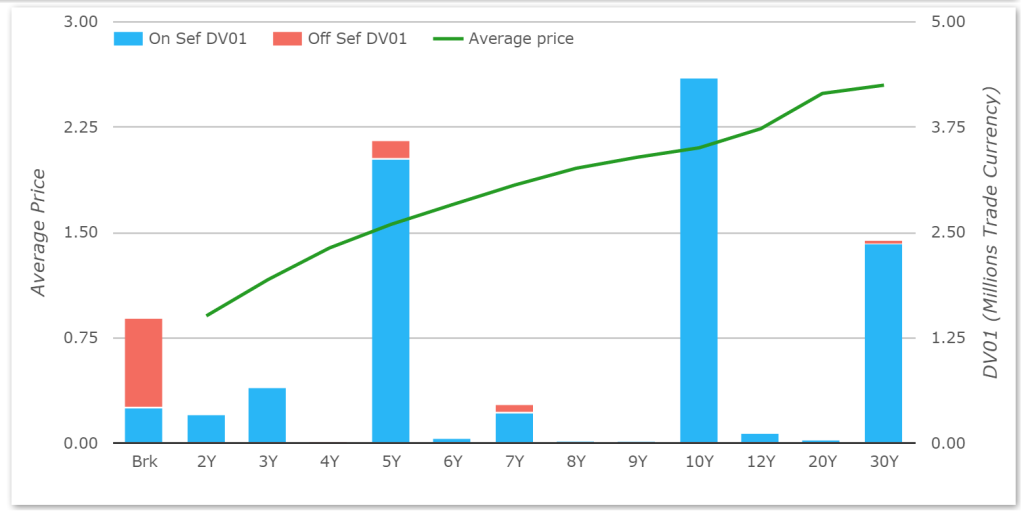
As we Tweeted, the large moves negative were also accompanied with some impressive volumes. In DV01 terms, Thursday and Friday last week (5th and 6th Nov) were the 5th and 6th largest days in terms of volume for Swap Spread trading during 2015. That made it the 4th highest week this year for total Spreadover volume:

Maturity Profile
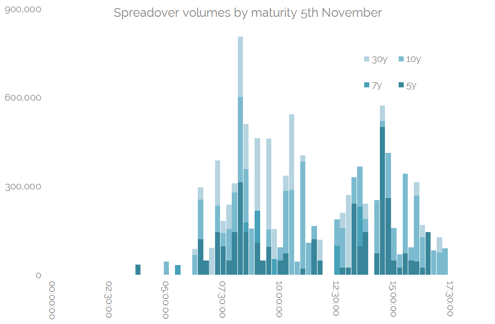
On the 5th November, there was significant volume in 30 year Swap Spreads, along with 5y and 10y:

Price Action
What did the trading day look like? If we segment the day into 15-minute periods, we can see how the trading of risk evolved throughout the day:

Showing:
- All times are Eastern Standard Time
- An active morning, a lull around lunch and an active afternoon
- But it doesn’t yield anything too revolutionary – the ebb and flow of volumes there is reminiscent of most trading days
- What we need is an added dimension – Price.
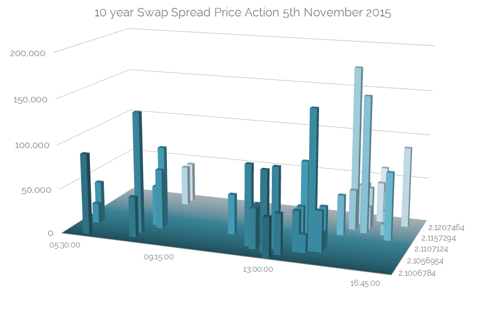
As I wrote recently about CDX, I’m not convinced that 3D charts are the way to go, but we really want to look at Price-Time-Volume on one chart. When we do so for the 5th November, it quite clearly shows us what happened:

Showing;
- The volume of 10 year Spreadovers trading by Time and Price on Thursday, 5th November 2015. I chose 10 years as there was the greatest volume and highest number of trade tickets.
- Time is along the horizontal x-axis
- Volumes are along the vertical y-axis
- Prices are along the z-axis
The trend is pretty clear from that chart – as we progressed through the trading day, yields consistently moved higher and volumes increased hand-in-hand with that move higher in yields.
In Summary
- Swap spreads moved significantly into negative territory last week.
- This was accompanied by an increase in trading volumes.
- We can see a clear trend that as yields increased throughout the day on Thursday, trading volumes also increased.
- Balance-sheet constraints are widely acknowledged as a contributing factor to this move into negative territory…
- …but we can also see clearly that the price action led to higher volumes throughout the day.
Keep an eye on SDRView Pro to make sure you know what’s happening in real-time. We can’t Tweet all of the interesting stuff that we see!
